Analysing the sample supertore dataset
The Objective:
-
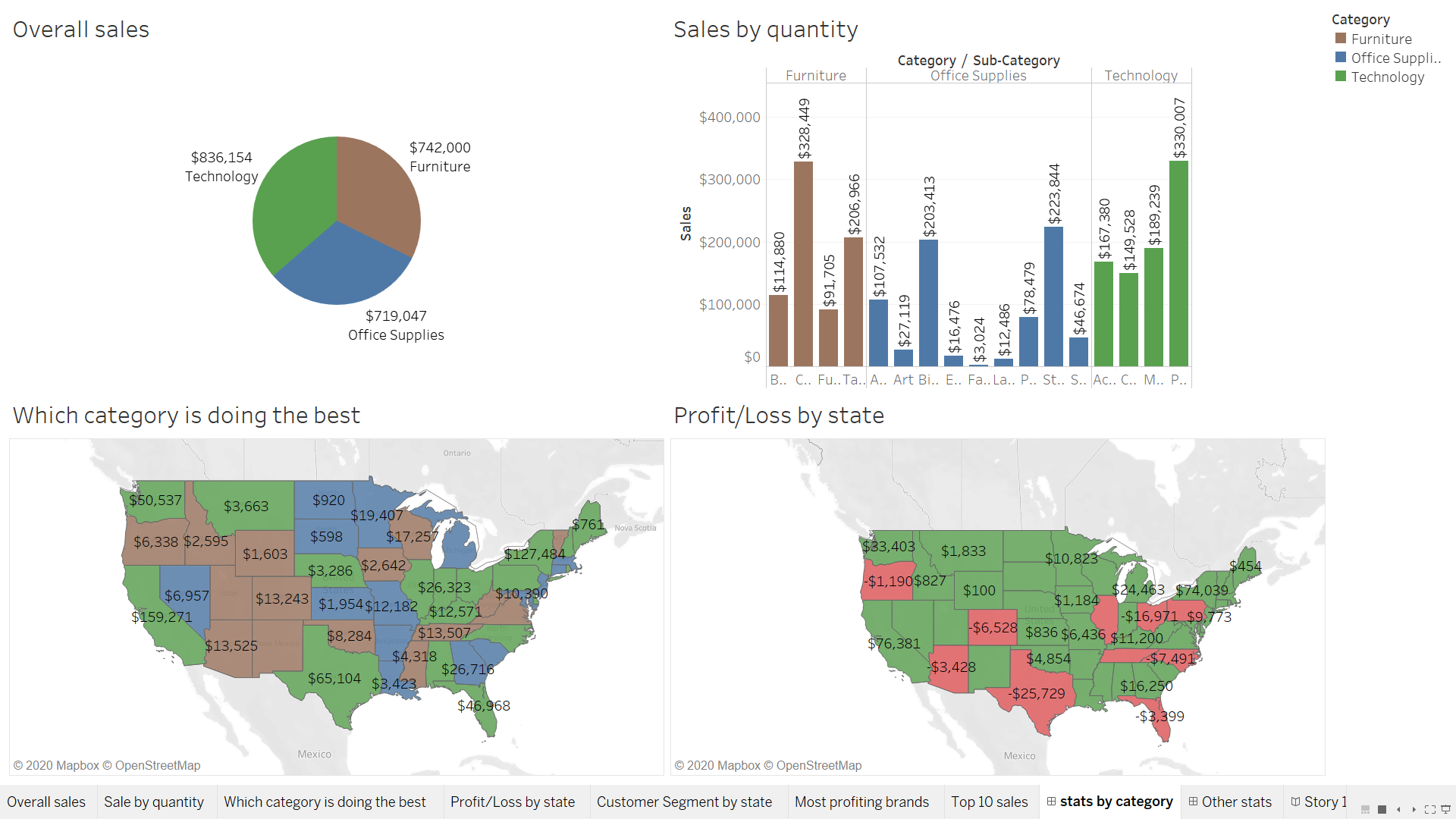
Look at which category is doing the best. Use an appropriate chart to visualize the same.
-
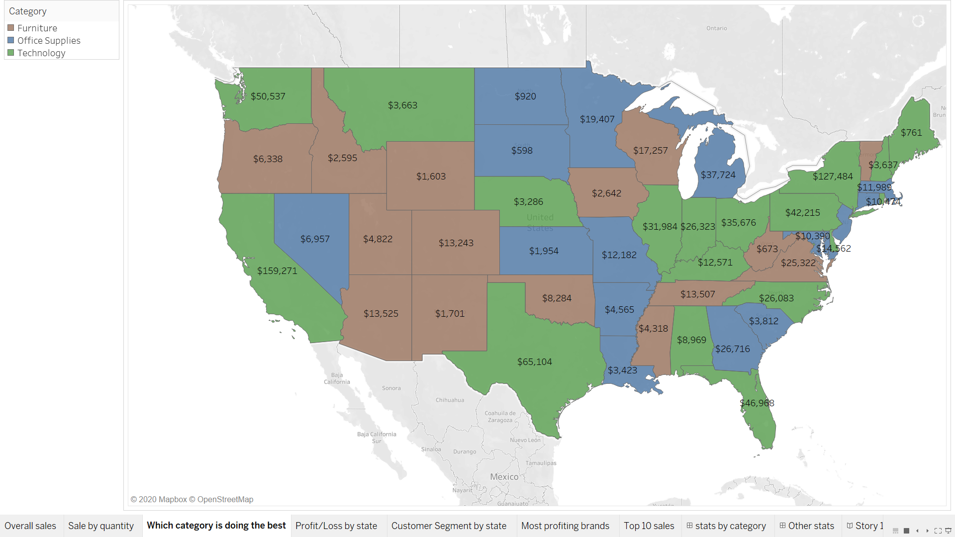
Find which category is doing the best by state and represent it using a map visual.
-
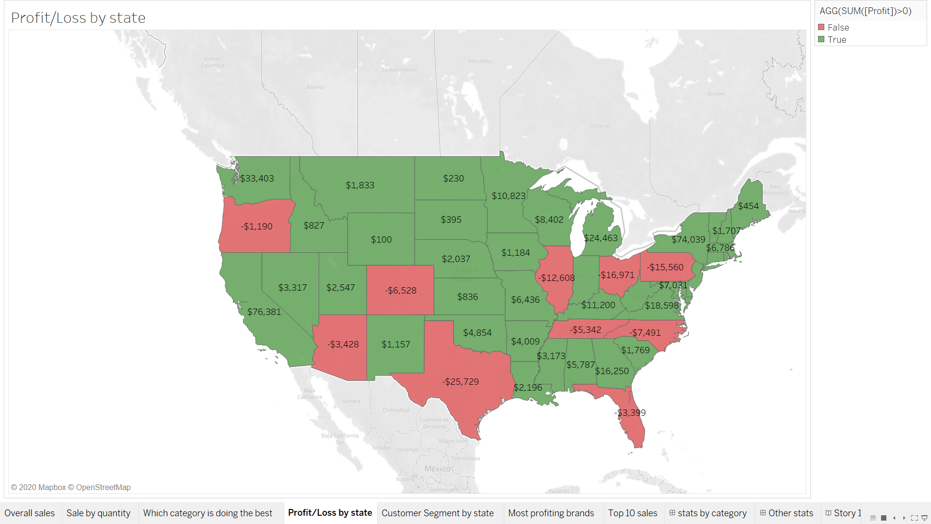
Find out our profit and loss position by state and represent it using a map visual.
-
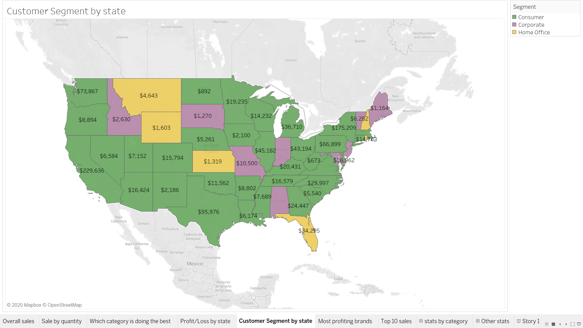
Find out which customer segment bought the most product by state so that we can make future decisions about targeting customers. Represent this on a map as well.
-
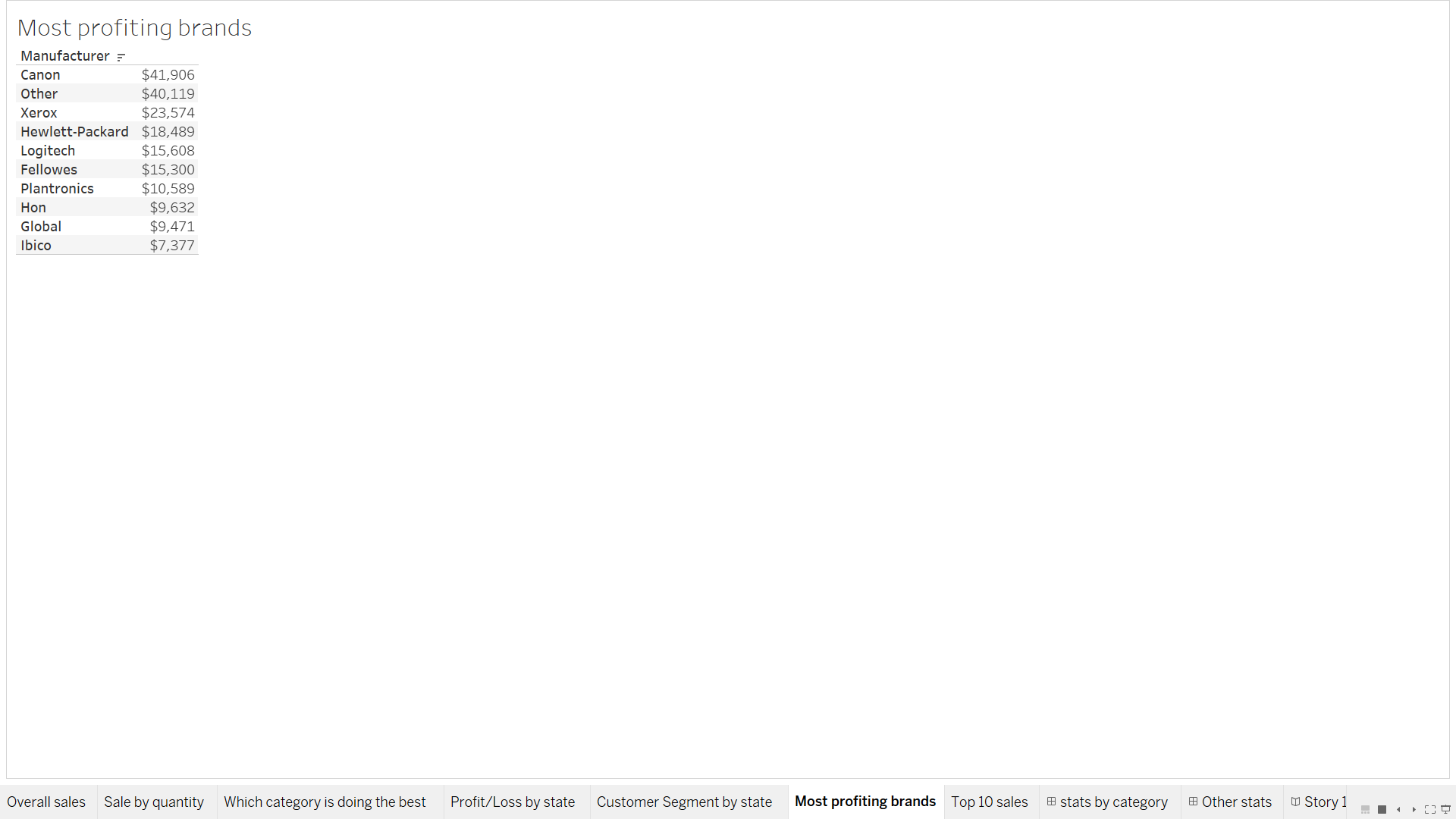
Look at the most profiting brands in our store. We could look to stock up accordingly in the future.
-
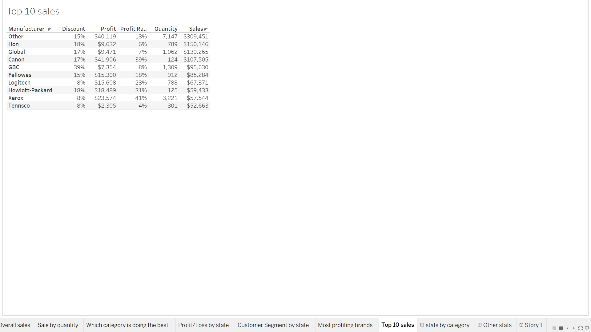
Next look at brands that have had the most sales. Give the number of items sold of a brand and how much discount was given along with profit.
-
Next create appropriate dashboards and a story board to present all your findings.
About the data:
- The dataset comes with every copy of tableau when downloaded.
Created Measures:
| Name | Formula |
|---|---|
| Rank | Rank(SUM(Sales)) |
| Profit Ratio | SUM(Profit)/SUM(Sales) |
Which category and product is doing the best.
| Sales by category | Sales by product |
|---|---|
 |
 |
Procedure Followed:
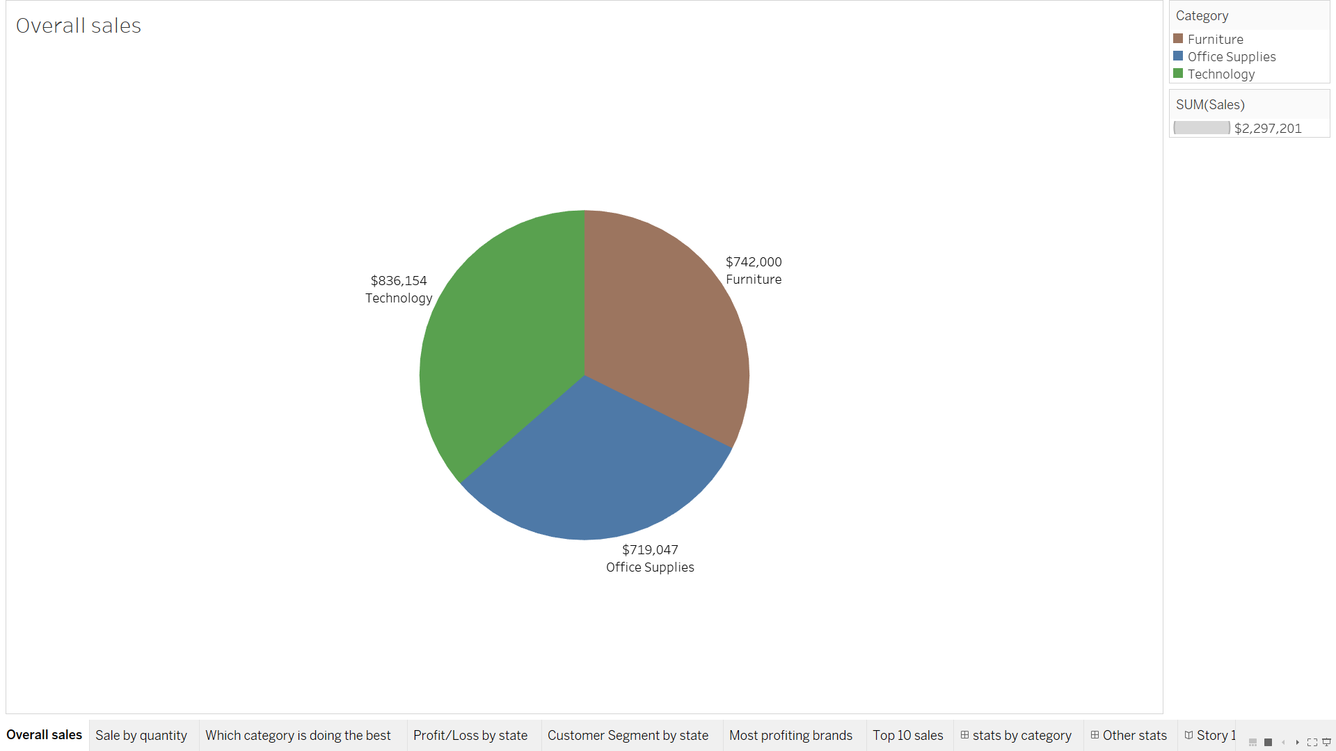
- Sales by category:
-
Select sales as SUM and drag into marks. Select type as text.
-
Drag category two times into marks. First select type as color and next select type as label.
-
Select pie chart to represent the data.
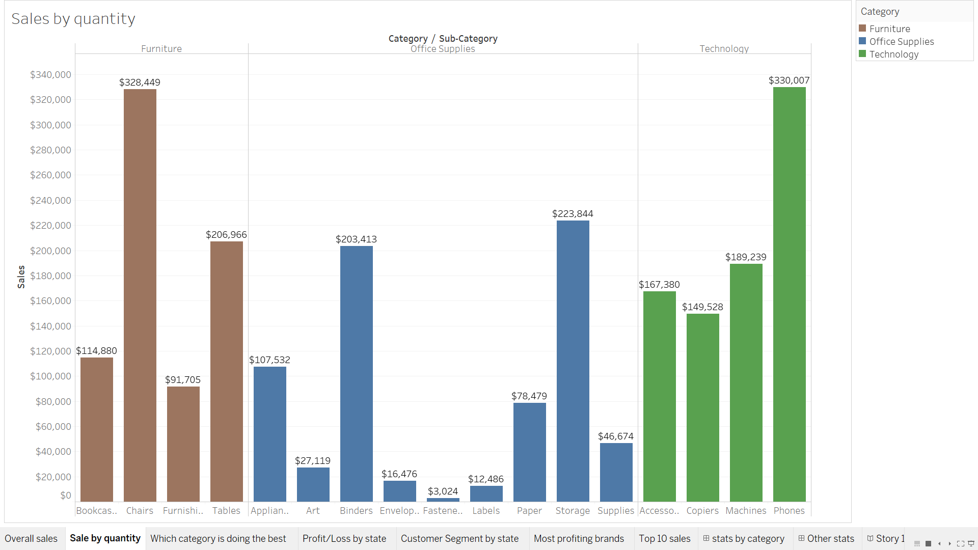
- Sales by sub-category.
-
Drag Category and Sub-category into columns field.
-
Drag SUM(Sales) into rows field.
-
Drag Category and SUM(Sales) into marks. Select type as color and label respectively.
Which category is doing the best by state and represent it using a map visual.
Procedure Followed:
-
We will use the created rank field to filter the category that is doing the best for each state. We will compute the rank field using the category and select range as 1 to 1 to make sure that we only have the top selling category by state.
-
We will select country, state and chose map to create a filled map visual.
-
We will also drag sales as sum into marks to show the value for sale for that category in that state.
-
We will add color to the map using the category field. Green represents Technology, Blue represents Office supplies and Brown represents furniture.
Profit and loss position by state.
Procedure Followed:
-
Drag profit and change the measure as profit > 0 to create two classes. Will allow us to color profit states and loss states by different colors. Select this measure’s type as color.
-
Select profit as marks and type as label.
-
Select coutry and state for creating the map.
Showing which customer segment is doing the best by state.
Procedure Followed:
-
Using the created rank measure we will filter out the categories by state that have the rank 1 in that state.
-
For this we will first drag the segment and state into rows field.
-
Next we will drag the created rank measure into the marks field and compute it using the segment field. This will make sure that we are ranking each category as 1,2 or 3 within each state.
-
Now we will drag the rank measure into the filter and compute using segment. Next we will give it a range of 1 to 1 so that we have only values that have the rank 1.
-
Now we will drag sales into marks field and select as label.
-
Select filled map as the visual.
Most profiting brands.
Procedure Followed:
-
Select manufacturer as rows field.
-
Select profit as marks and type as label.
-
Add manufacturer into filter and select top 10 based on the field profit.
Brands that have had the most sales.
Procedure Followed:
-
Along with looking at the top 10 sales we will also be looking at discount, Profit, Profit Ratio, Quantity and Sales.
-
This will allow us to see how are these various parameters impacting sales.
-
Select all the above parameters as marks and change display average discount, and leave other parameters as is.
-
Select manufacturer for rows field.
Create appropriate dashboards and a story board to present all your findings.
Dashboards
| Sales and profit by category | Top 10 profit and Sales, performance by segment. |
|---|---|
 |
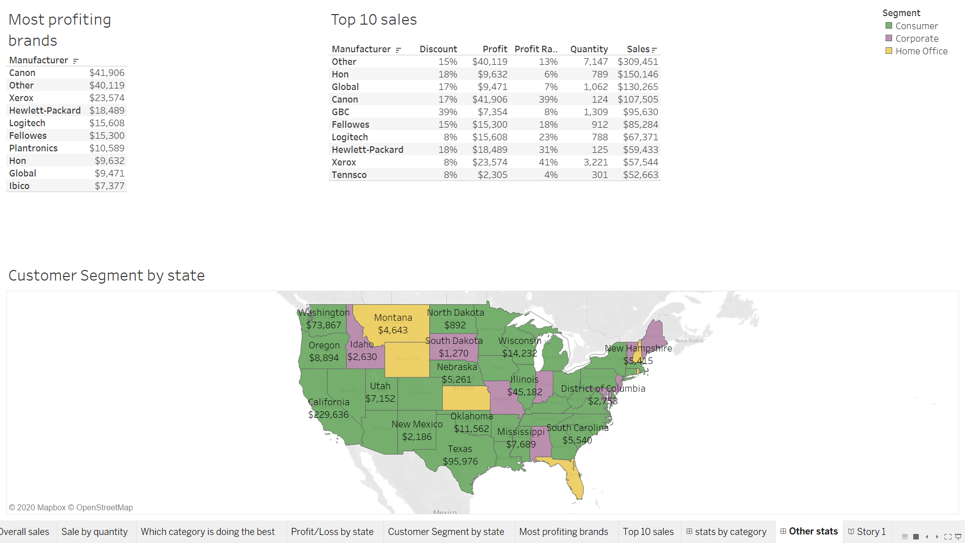 |
A story board was created using the above two dashboards.
Conclusion.
-
We see all our product categories perform equally well from the first pie chart that has been shown above.
-
Drilling down within the 3 categories we see that chairs, storage and phones have the highest sales within each category. Infact these 3 products makeup approx. 37% of sales for the company.
-
Next we see which category sees the highest sales by region. Its no surprise that states like California, Texas, New York have technology as the number one bought product. A good thing is that we have an even spread for each of our product categories across the country which shows consistant performance all across the board.
-
The profit/loss visual on a map is key to know in which regions are we not doing so well. For example, although we saw high technology sales in Texas, still we are in the red in that state. This also tells us that not one single category is our main profit driver. All the categories equally contribute to overall profit.
-
Its no surprise that by state the consumer segment is our number one buyer as it should be. This is a store for the people first. Its a bit surprising to see that home office and corporate segments also dominate some states. It probably could be because superstore has not yet opened up retail chains in these states. Or it could be lack of consumer marketing in these states. This must be further looked into.
-
Next we look at the most profiting brands and its no surprise that Canon is on top with their high end camera technology being sold through these stores. Whats interesting to see is that most of the brands are major tech companies in this list.
-
Sales and profit are two different things. Looking at sales we see Canon to be a bit behind but this is where margins come into the picture. Probably Canon products have a high markup which is why they are the highest contributor to profit. Also we don’t see plantronics in the list where as it is present in the top 10 most profiting brands.
Project Files:
Please find the project files here.
