A procurement analysis of inventory
| Inventory by category | Inventory by product |
|---|---|
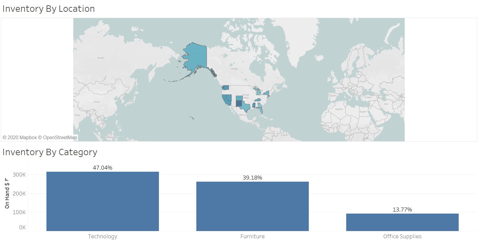 |
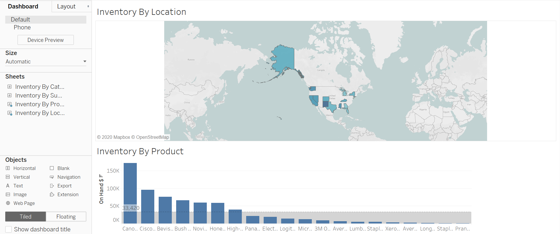 |
About the data:
Supply chain data of a company that shows purchased goods with detailed information about various parameters.
| Column | Measure/Dimension |
|---|---|
| Category | Dimension |
| Committed | Measure |
| Jan demand | Measure |
| Location | Dimension |
| Max | Measure |
| Min | Measure |
| Number of Records | Measure |
| On PO | Measure |
| On hand | Measure |
| Product Name | Dimension |
| SS | Measure |
| Sub- Category | Dimension |
| Unit Cost | Measure |
| Unit Price | Measure |
| Concat | Dimension |
| On Hand | Measure |
| Order 1 | Measure |
| Order | Measure |
Analyzing the data:
-
Find the inventory by :-
- Category
- Sub Category
- Product
- Location
-
Create a Dashboard
-
Create a story showing the visuals from Location, Product & Category
Category:
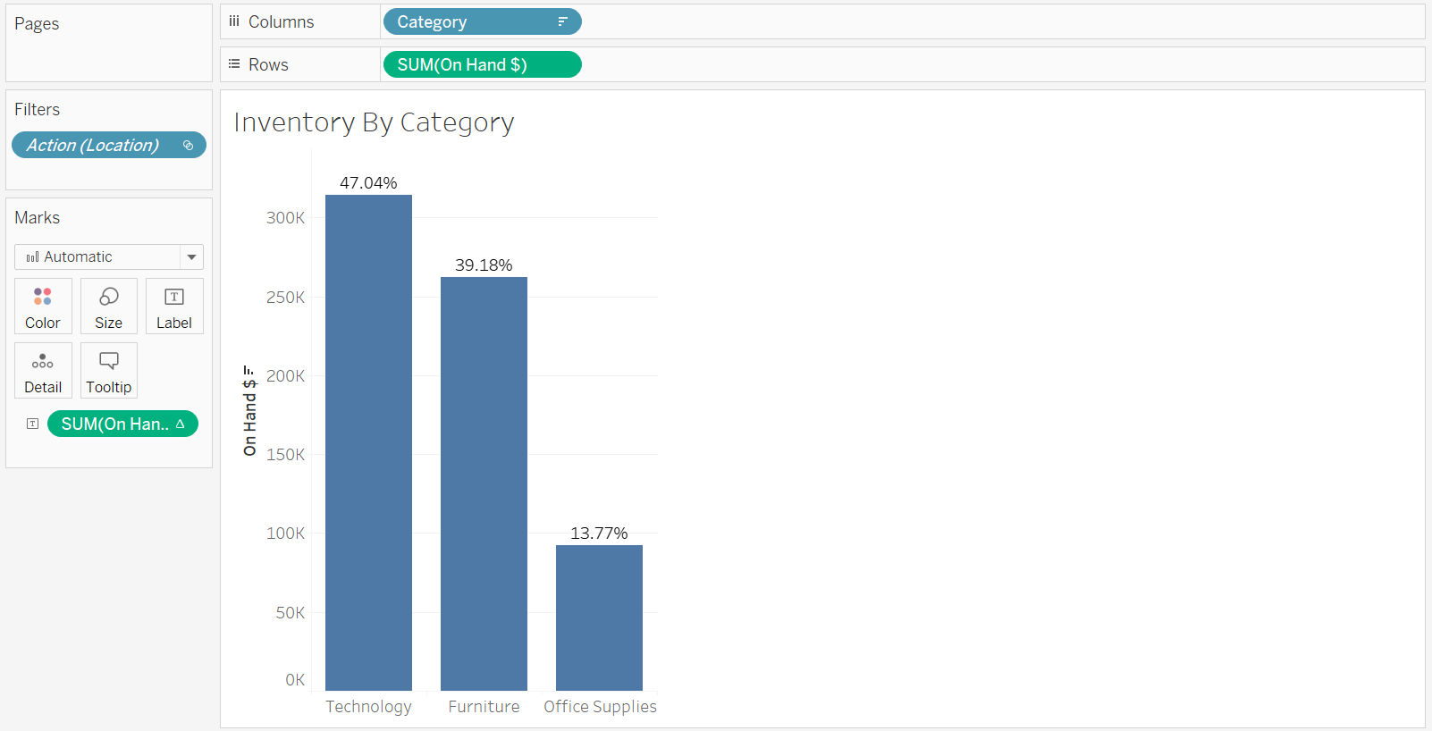
Procedure followed:
- Dragged Category into columns field.
- Dragged On Hand as SUM measure into rows field.
- Created a field called On Hand $ = On Hand * Unit Price.
- Dragged created field to marks section as SUM and changed type to text.
- Added table calculation as percent of total.
- Chose Bar chart to show comparison between inventories.
Sub-Category:
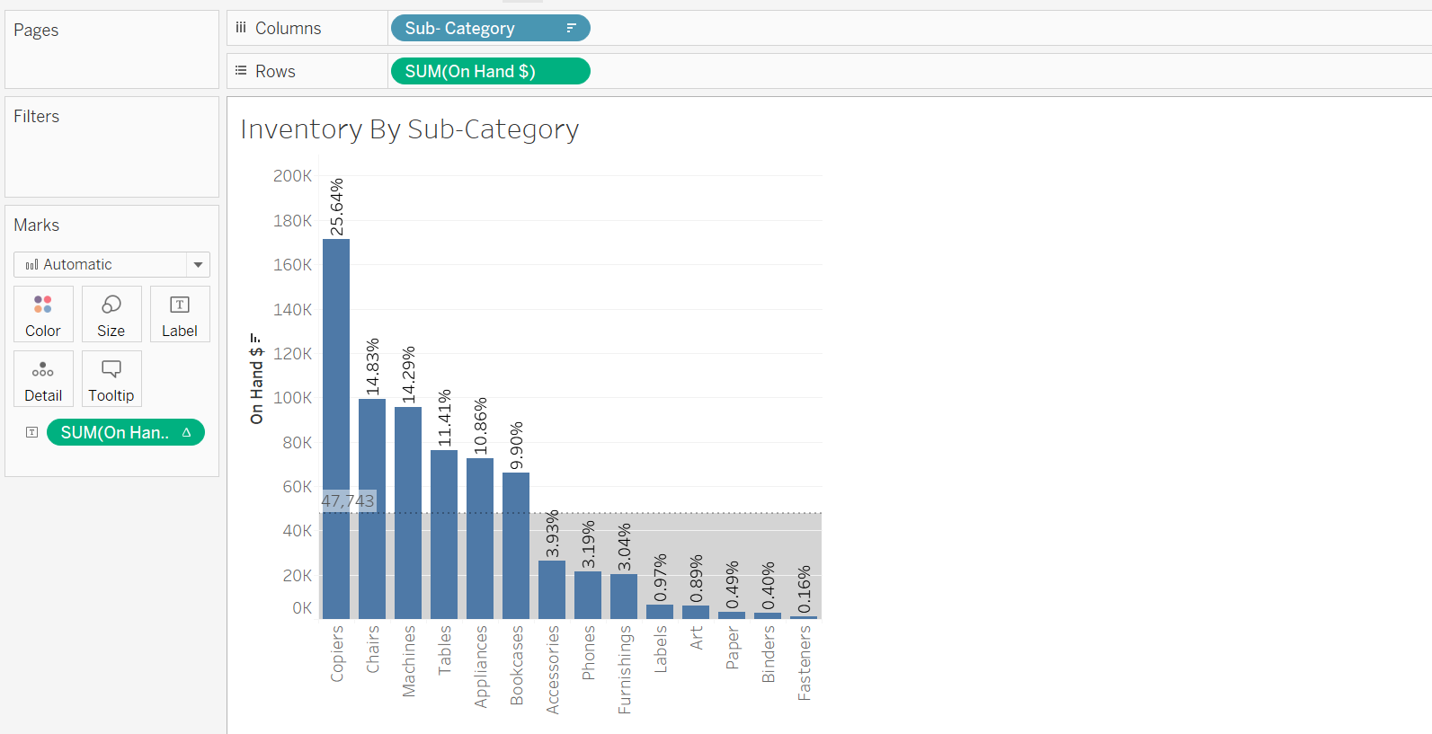
Procedure followed:
- Dragged sub-category dimension into columns field.
- Dragged on hand as SUM into row field.
- Added on hand $ field into marks as sum.
- Added table calculation to on hand $ as % of total.
- Selected bar chart.
Product:
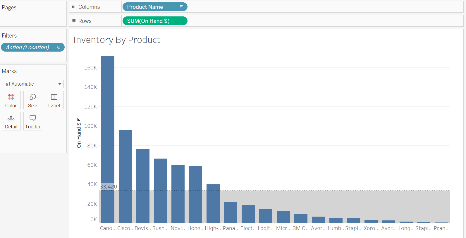
Procedure followed:
- Dragged Product name dimension to columns field.
- Dragged on hand as SUM into row field.
- Selected bar chart.
Location:
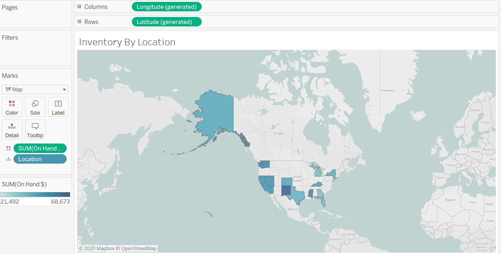
Procedure followed:
- Dragged location into marks field. Automatically latitude and longitude were selected into rows and columns field respectively.
- Next selected On hand $ and changed type to color.
Creating a dashboard for inventory by category.

Procedure followed:
- After creating all our visuals we would now create a dashboard based on our requirements.
- Drag the Inventory by location visual created into the dashboard.
- Next drag the inventory by category visual into the dashboard.
- The dash board allows us to see inventory by category for each location letting us drill down into specific details.
Creating a dashboard for Inventory by product.

Procedure followed:
- Similar to the previous dashboard but the only change is that instead of the product category visual we drag in the Inventory by product visual.
- The functionality is same as the above dashboard.
Creating a story showing the visuals from Location, Product & Category:
| Storypoint1 | StoryPoint2 |
|---|---|
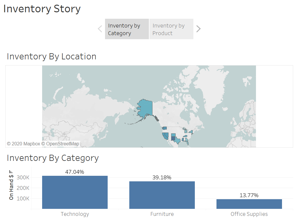 |
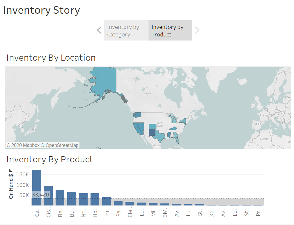 |
Procedure followed:
- Created a new story point for each dashboard.
- This allows us to present the data in a seemless manner.
- We first look at inventory by category for each location.
- Then we drill into the data to look at inventory for each product by location making a seemless transition between the two.
Conclusion:
- Technology has the highest inventory value in the companies warehouses.
- Copiers seem to be their prime source of business since it makes up a large chunk of the companies inventory value.
- To be more specific the Canon PC940 copier has the highest value in terms of inventory.
- New Mexico is currently holding the largest amount of inventory.
Project Files:
Please find the project files here.
